Day to day
The month calendar
The third way to read your spending: by category, by text, and by when. A grid where every day is painted against your daily pace.
- 1
By when, not by category
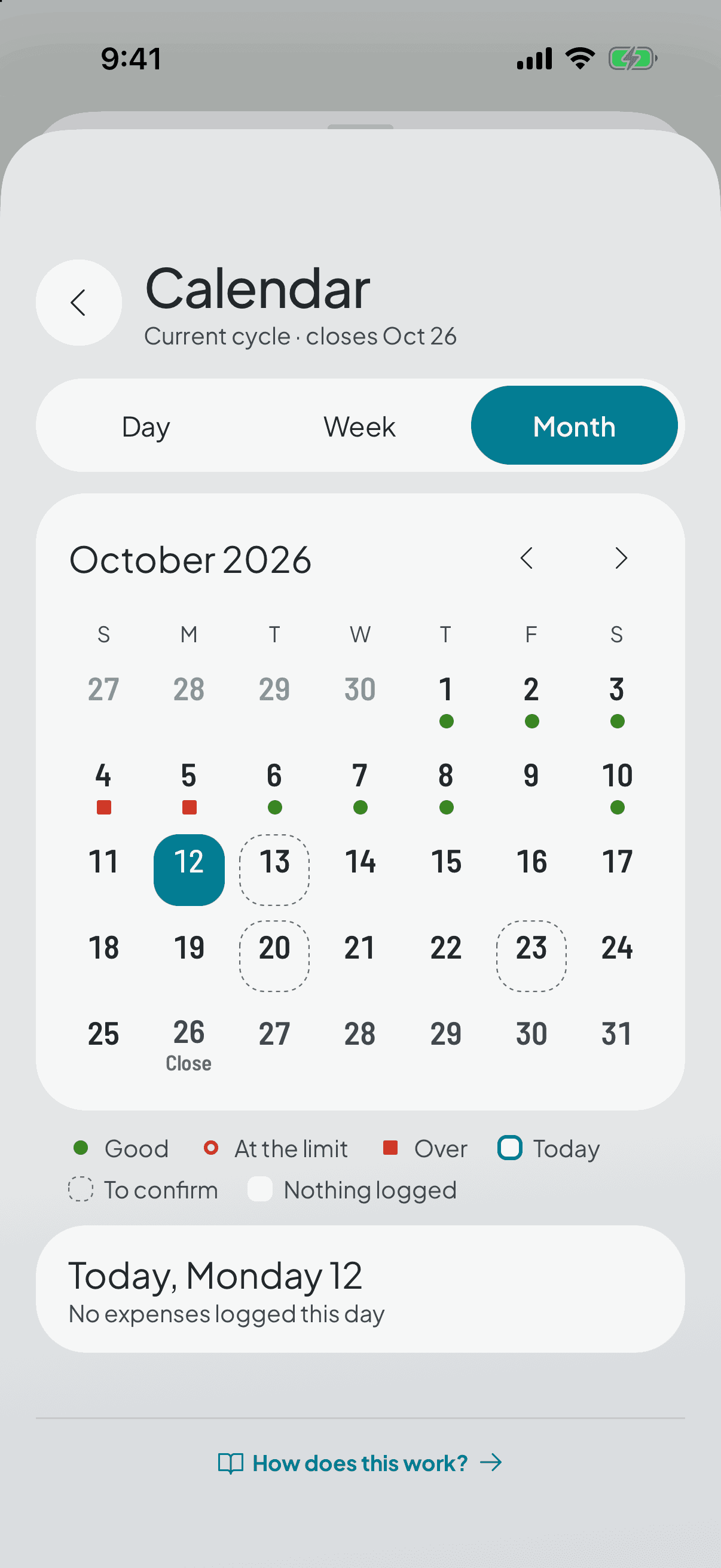
So far you've read your spending two ways: by category, on the home screen, and by text, in the search. The calendar sorts it by when: a month grid where each day is painted by what went out that day.
The boundary of your cycle is marked inside the month. Your cycle doesn't start on the 1st, so that line tells you where what you're looking at starts counting from.
- 2
The colour is measured against your pace, not against an ideal
The three lights compare what you spent that day with your daily pace: the cycle's spendable money divided across its days. The legend gives you both figures, so the colour is never an opinion without a number behind it.
That's why rent day comes out coral, and it's accepted: it's the day the money actually left. The two ways out — leaving recurring expenses out of the colour, or spreading them across every day — were both dropped, because the first makes the colour lie about how much went out and the second stops it describing a day at all.
- 3
A blank day is not a green day
A day with nothing logged stays blank, in a state of its own. It isn't painted green, however tempting that seems: the app can't tell whether you didn't spend or simply didn't log it, and rewarding the silence would teach you not to log — the very habit it's trying to give you.
It's a deliberate exception. The rest of the app avoids a daily verdict — the close informs you, it doesn't scold — and here there's a colour per day because sorting by when says nothing without one. What was protected is that it never rewards silence and never judges what isn't spending yet.
- 4
Tap a day and see what went out
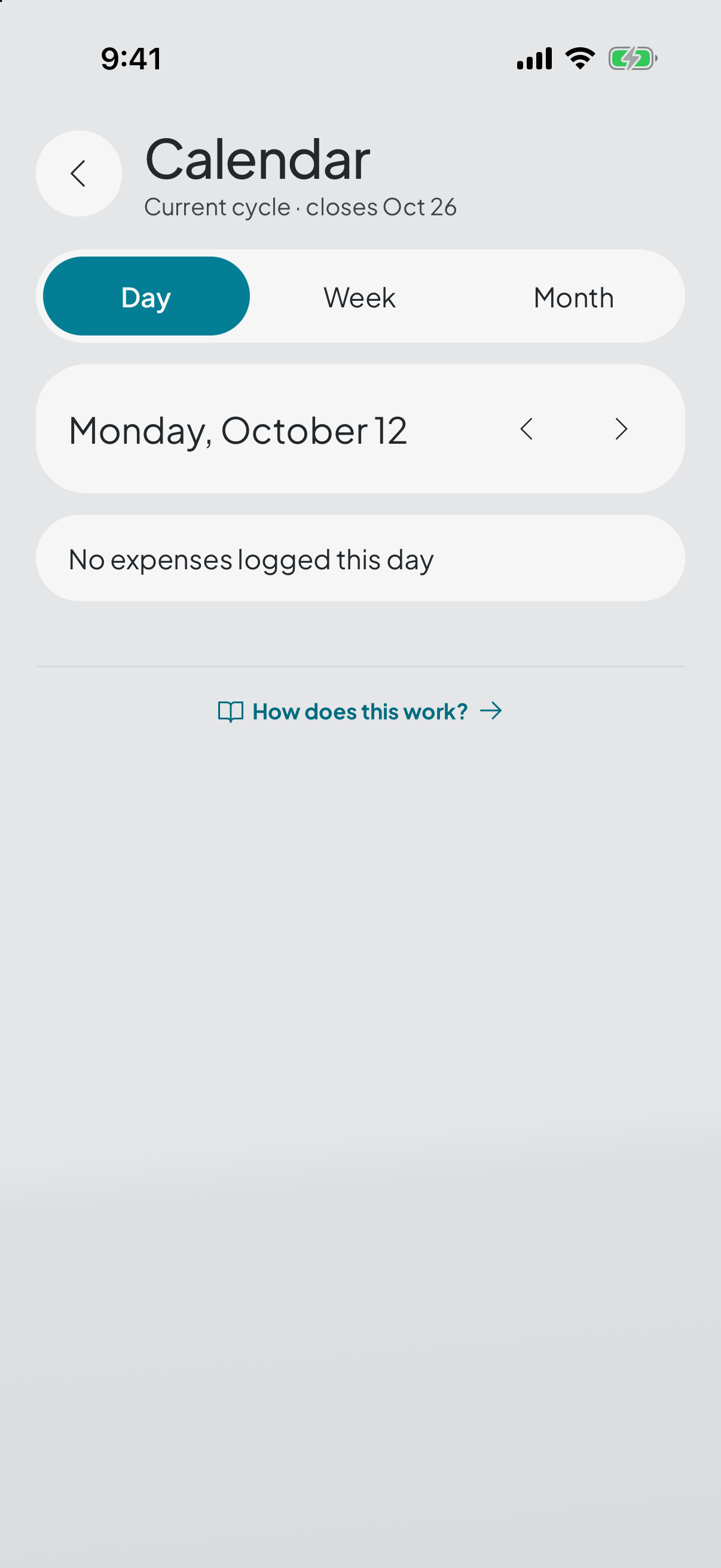
The loose expenses, and the recurring ones you confirmed too, each on the day its template says rather than the day you happened to open the app.
Whatever you set aside for savings sits in its own row, outside the total: it didn't leave your pocket, it only moved. And a recurring expense you haven't confirmed carries its cyan mark: it already lowered what's available, because it's reserved, but it takes none of the three lights, because it isn't spending yet.
- 5
How far back you can look
The calendar is free within your visible history — the last three closed cycles. Seeing months further back comes with full history, which is Premium.